Laurel
Spend more time living with automatic timesheet technology
Role
Design Director
Details
Branding / UX / Web design
Project summary
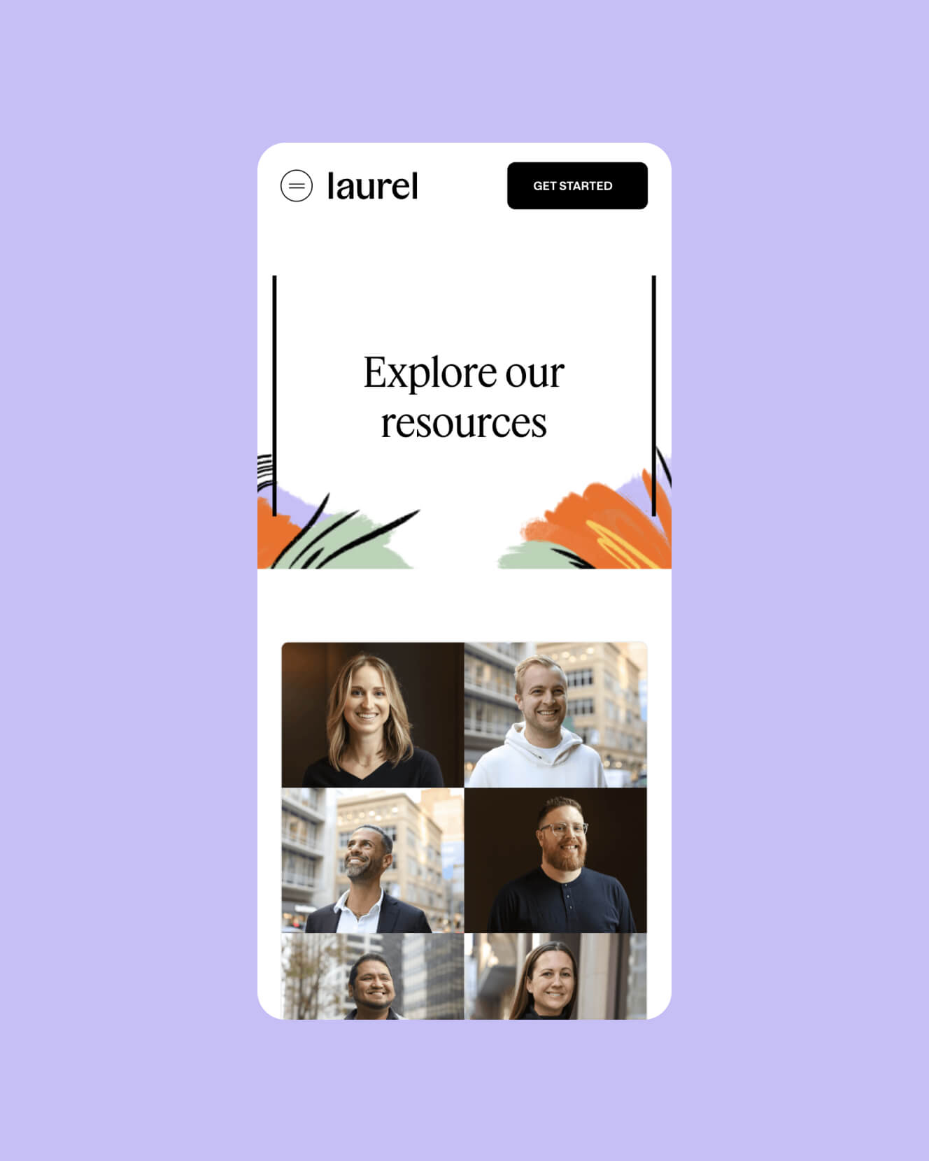
Laurel (formerly Time by Ping) needed a brand that matched the ambition of its mission: giving time back to workers. The existing identity—rooted in legal timekeeping—limited perception, slowed product expansion, and failed to connect with a broader, more human audience. The opportunity was to reframe time not as something tracked, but as something experienced.
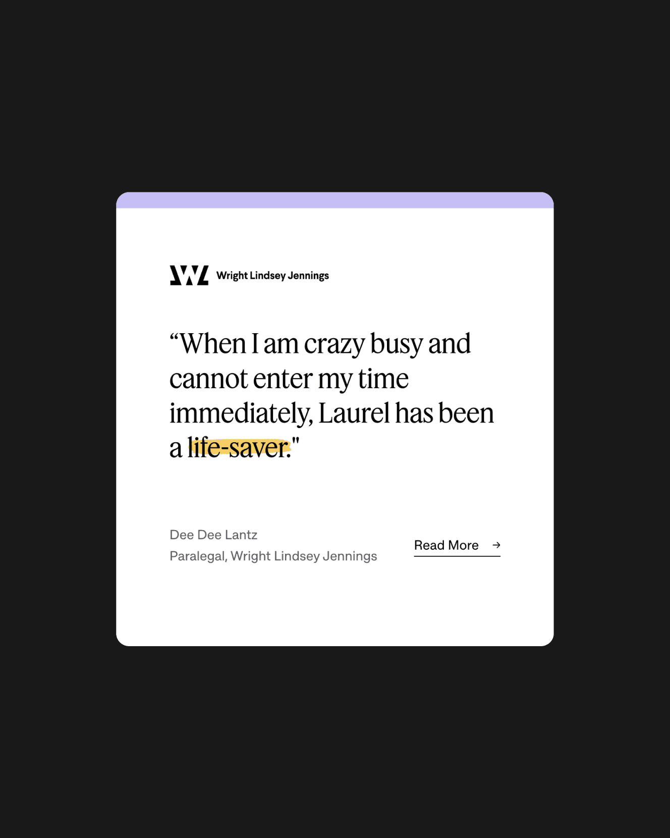
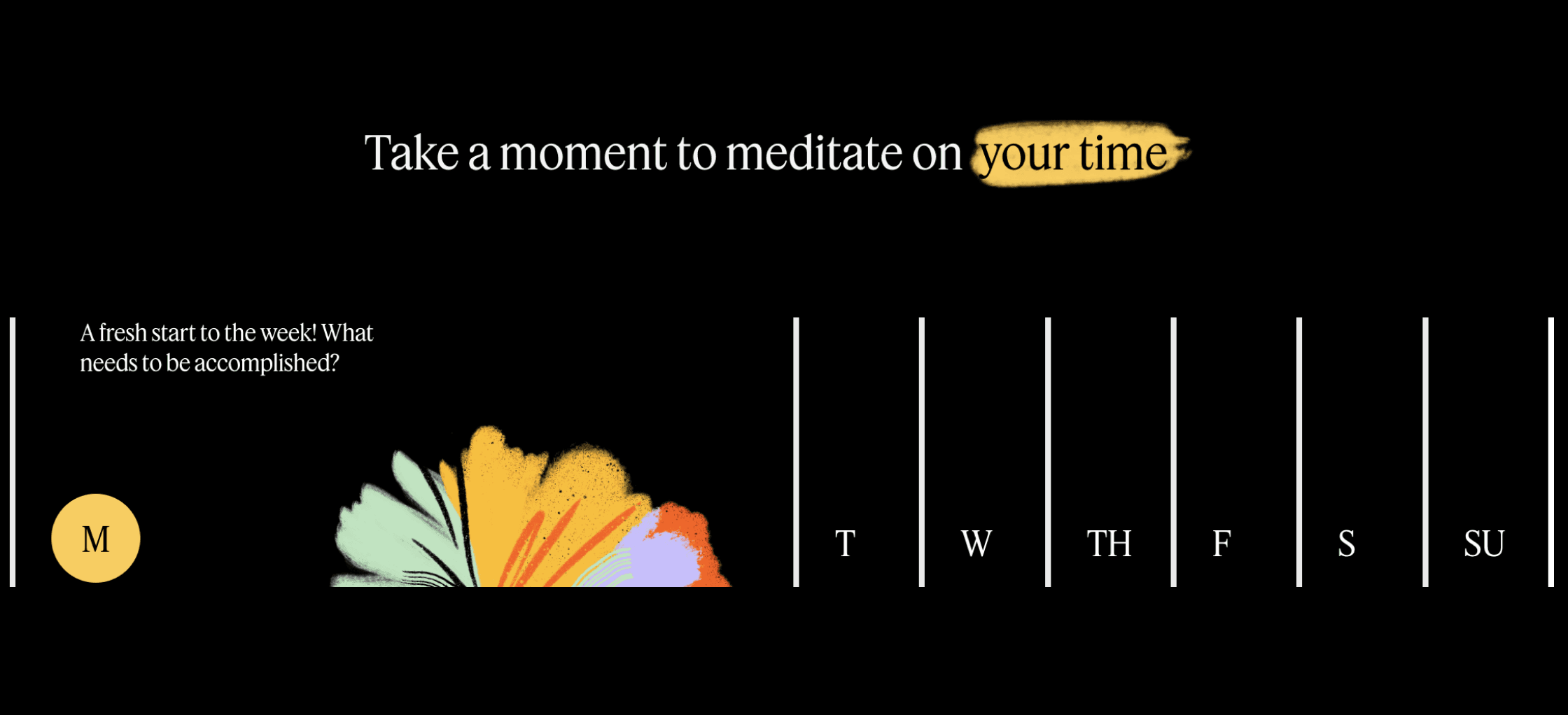
We reimagined time as a visual system—finite yet flexible—using timelines, bars, and motion to express structure, while vibrant, organic illustrations conveyed the freedom and possibility of reclaimed time. A restrained black-and-white foundation kept the brand professional, while bold color brought warmth and approachability. On the website, clear wayfinding guides multiple audiences through Laurel’s product and purpose, pairing thoughtful page intros with proof points that build credibility and momentum.
Project summary
Laurel (formerly Time by Ping) needed a brand that matched the ambition of its mission: giving time back to workers. The existing identity—rooted in legal timekeeping—limited perception, slowed product expansion, and failed to connect with a broader, more human audience. The opportunity was to reframe time not as something tracked, but as something experienced.
We reimagined time as a visual system—finite yet flexible—using timelines, bars, and motion to express structure, while vibrant, organic illustrations conveyed the freedom and possibility of reclaimed time. A restrained black-and-white foundation kept the brand professional, while bold color brought warmth and approachability. On the website, clear wayfinding guides multiple audiences through Laurel’s product and purpose, pairing thoughtful page intros with proof points that build credibility and momentum.