Laurel
Spend less time wondering and more time living with automatic timesheet technology

SERVICES
Branding / UX / Web Design
Platform
Webflow
Role
Design Director, Red Antler
Opportunity
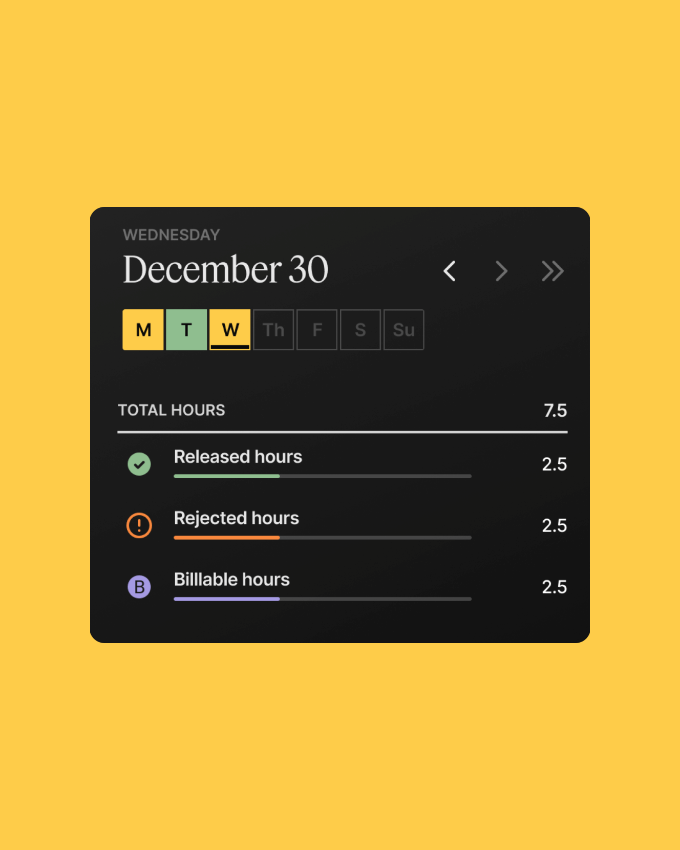
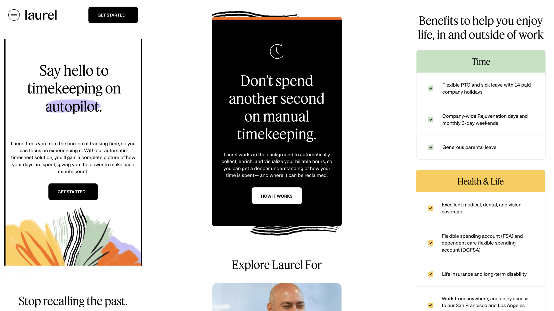
Laurel, previously Time by Ping, wanted a new look as bold as their mission to return time back to workers. Laurel frees workers from the burden of tracking time, so they can focus on experiencing it. The brand’s previous identity, which was tied to legal timekeeping, was holding them back from launching new products and reaching a broader ranger of timekeepers.
Solution
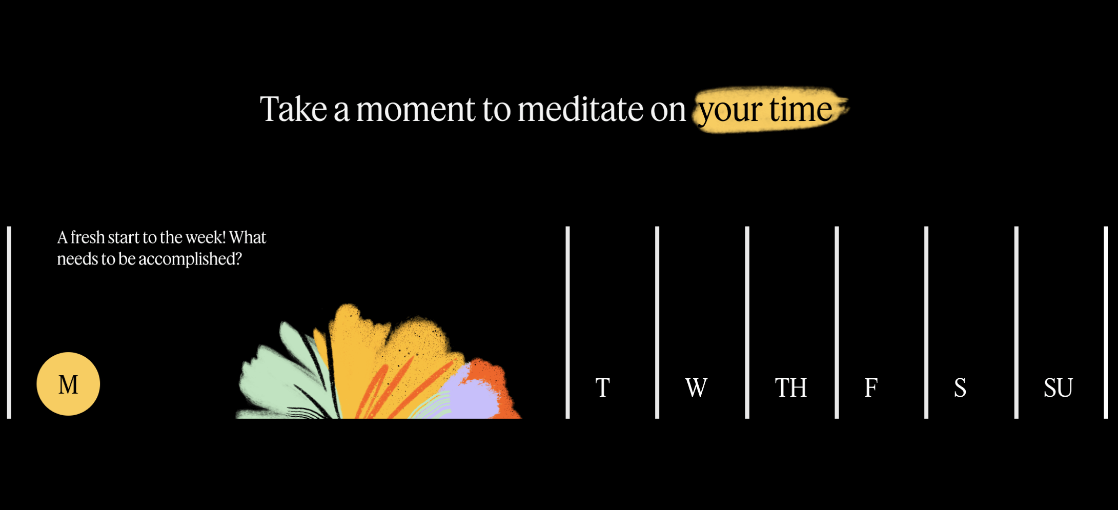
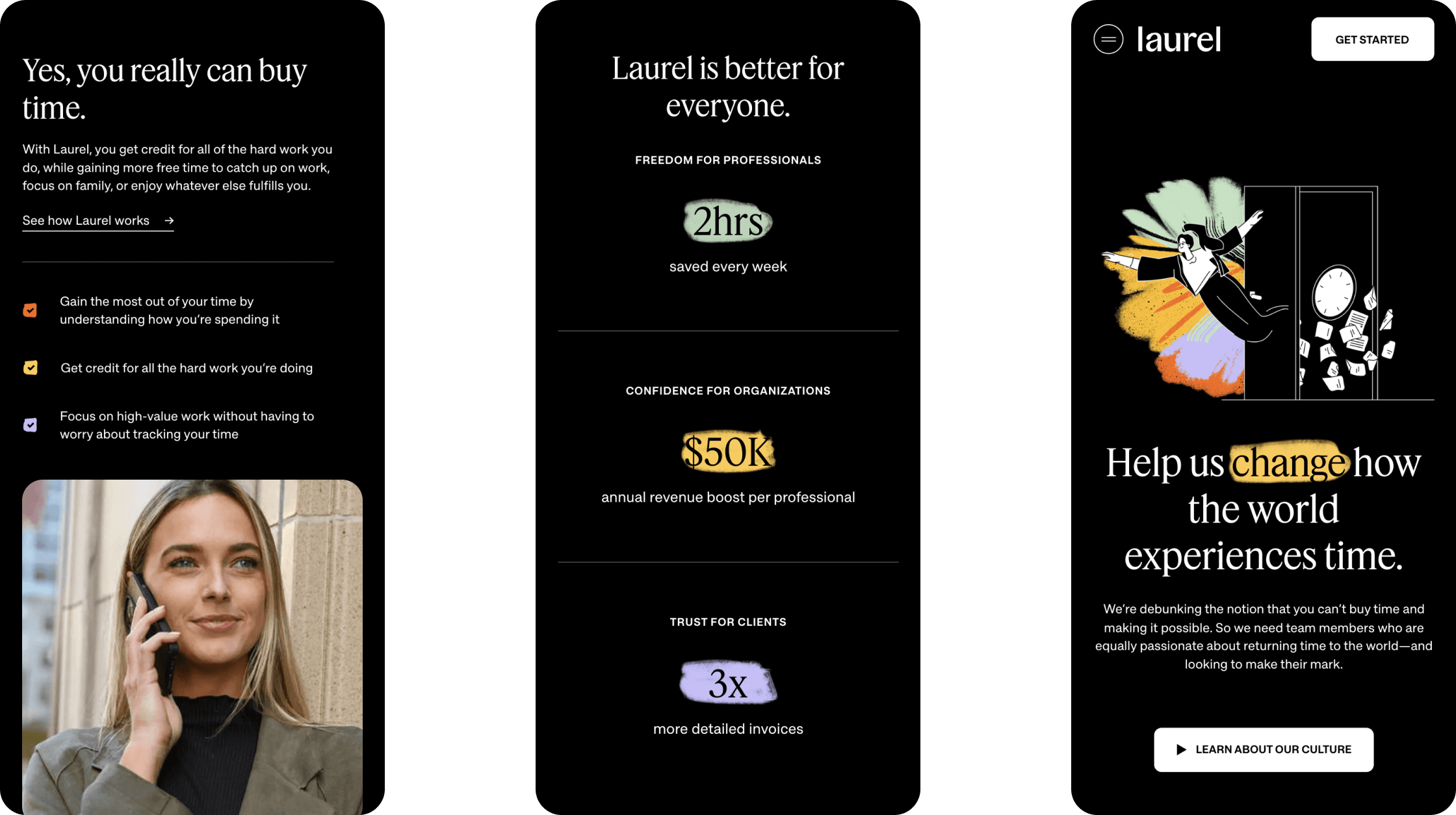
For the new brand identity, it was imperative to craft visual solutions that reimagined how we depict time. Time is finite, it has a beginning and an end, so timelines and bars become imperative to the visual language. Everyone enjoys their free time but chooses to spend it differently. Bright illustrations represent the joy end endless possibilities of having more free time. The illustrations are refined yet organic to signify the brand’s human-first approach to business. The primary palette is black and white for a professional look but the pops of vibrant color make the brand approachable and friendly.
For the website, it was important that users understood the product but also the mission behind Laurel. Thought provoking page intros are paid off with testimonials, success stories, and statistics. Since the website speaks to a variety of audiences, clear wayfinding was developed for professionals, organization leaders, and those seeking to learn more about the company. The illustrations and time bar animations draws users in and help break up content.